Sometimes putting an email together can be hard work, so here are 5 quick design tips to improve them (with 4 examples of different but effective emails in the gallery below).
- KISS (Keep It Simple, Stupid!) A single column email makes it much easier to plan, and also for your recipients to view an email, especially on the mobile. If you’ve got multiple columns because a lot of people review on smaller devices, it can actually look a bit too busy, so you really want to make it easier to read. You want to think about how it will look on a mobile, because even if people open on their computer they may open on a mobile first.
- Use clear, scannable headlines. So your text should be really scannable, so use things like bullets and bold text to make it easy for somebody to just glance through the email. Don’t overuse loads of different fonts or colours, again because it makes it look a bit too busy. So, 2 colours plus black potentially, and using bold for headlines and a headline font and a text font is probably best.
- Avoid using too many small images. If you want a really modern look, go for a big hero image that’s full width or almost full width and is obviously a relevant image. That’s what people want, they don’t want something that’s completely irrelevant, so try and find something that is really going to speak to them, but also make sure your email is viewable if they haven’t downloaded images yet.
- Animated GIFs. If you really want to make something stand out, think about animated GIFs, they make them a bit more interesting, and it can be quite a good way to demonstrate product features or get a particular message across, there’s a great headspace one that’s good for this. Also, you can make them for free, just look up “free animated gif maker” and providing you’ve got the different images you could do it for free.
- Call to Action. Make sure your call to action is clear. I recommend repeating your call to action at least once, particularly if there is only the one. Potentially use it both in an image or a button or something like that, but also within the text itself.
If you use those design tips your emails will have a much sleeker, scannable, modern look to them and they should start to generate you some great results.
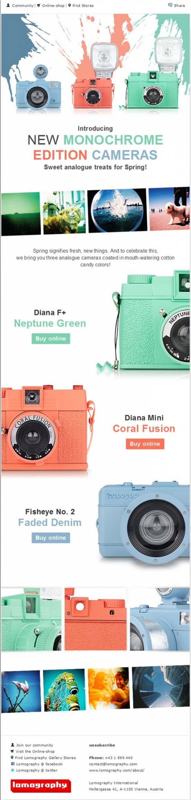
Colour Cohesion
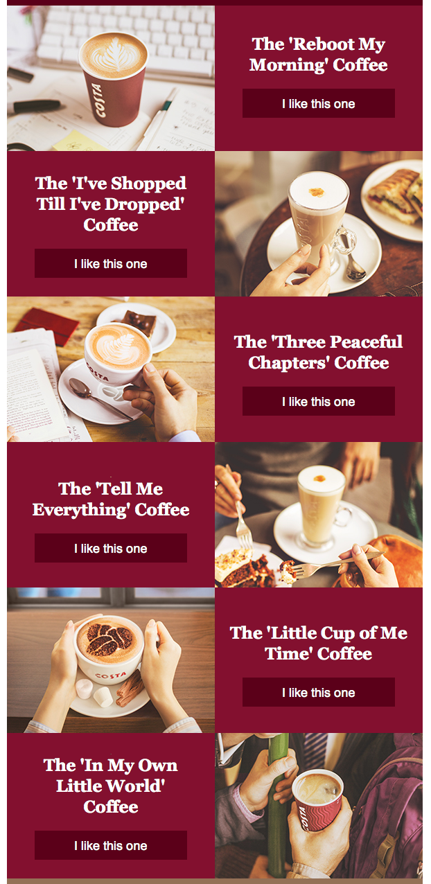
Costa Segmentation Example
Clean ZigZag
